Untangling the hairball using statistical inference
Torwards more dignified ridiculograms
TL;DR — Network visualization is often done in the wrong way: first a network layout is produced using a heuristic, and then follow-up analyses are performed and evaluated according to the layout. This is an inversion of priorities that subjugates algorithmic analyses to unreliable and often misleading visualization heuristics. Here I show how this inversion can be fixed: by performing the more meaningful algorithmic analysis first—like clustering or ordering—and then subjugating the visualization heuristics to it.
The seductive futility of network visualization
Network visualization is a ubiquitous task in data analysis. We can’t seem to resist trying to just see the network structure with our own eyes. Our visual cognitive abilities can be a powerful tool, since we can effortlessly identify some kinds of patterns that would otherwise be difficult to detect. It would be wasteful not to harness it.
Unfortunately, network data suffers from a fundamental problem of representation. Namely, networks are usually not low-dimensional objects to begin with, so we cannot directly inspect them in their “natural” space1—unlike clouds, rocks, trees, insects, etc. Instead, we need first to project them into a low-dimensional representation (usually in 2D) that is digestible to our visual apparatus. This is a rather violent act that invariably distorts the structure in the data in important and unavoidable ways. With network data, not only “is the map not the territory”, but these two live in radically different universes. A universally faithful representation of arbitrary networks in 2D (or even 3D) is simply impossible, and therefore is not a sensible goal.2
1 Notable exceptions are spatial networks common in transportation systems, such as roads, railways, subways, etc.
2 Faithful projections are not even always possible between spaces with the same number of dimensions, such as from the surface of a sphere to a plane.
In addition to these unavoidable distortions, data visualization in general is a double-edged sword—our sensitive pattern detection abilities mean that we can also see structures in the data that are not really there, or at least not in a statistically meaningful way.

This phenomenon is called pareidolia, which is an instance of a more general cognitive bias called apophenia—the tendency to perceive meaningful connections between unrelated things. Everyday examples of this include seeing common shapes in clouds, and faces in inanimate objects.
The combination of these unavoidable distortions with our cognitive bias to identify spurious patterns is not a good one for network visualization.
Let us inspect some representative instances:
(C’est un ridiculogramme!)
(Credit: Mathieu Jacomy)
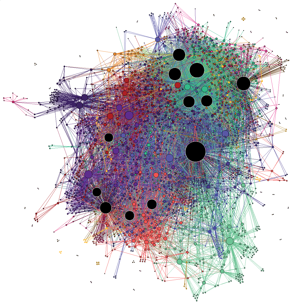
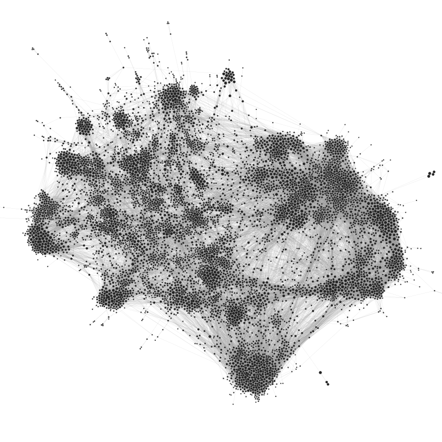
It’s easy to ridicule the visualization on the left: it’s the typical hairball that conveys little useful information. It overloads our pattern recognition abilities, and the whole thing just looks like a confusing mess. However, the visualization on the right is arguably also problematic. Despite showing a seemingly clearer picture—we can see a more obvious modular pattern—how can we be sure it’s not an illusion, caused by the algorithmic distortion, our cognitive bias,3 or both?
3 In fact, one particularly important instance of apophenia is the so-called clustering illusion: The tendency to see clusters in data which cannot be statistically justified. Some community detection algorithms suffer from the same problem.
Force-directed layouts only see assortativity
It’s important to observe that both drawings above have been obtained with the same algorithm: a force-directed layout.
Force-directed layout algorithms try to make the edge lengths as small as possible, representing them as attractive forces between the nodes at their endpoints, which are then compensated by an overall repulsive force between every pair of nodes. The final node positions are the ones that balance these competing forces. The usual interpretation of these layouts is that nodes that are close in the projected space are also close in the native “unprojected” structure of the network, and therefore we should be able to observe modules and other kinds of structural patterns visually.
However, this interpretation is not quite true in general, or even often. Such projections are mostly distortions, and while they are informed by the large-scale network structure, they cannot encapsulate it even in situations where we know the network is embedded in a well-defined metric space of a higher dimension [1]—and much less so in the more general case when it’s not. Networks are rich high-dimensional objects that diffuse blobs drawn on a 2D surface cannot really capture; at least not if we are not carefully specific about what patterns we want to extract.
Some might argue that force-directed visualizations are good enough when the structure in the data is very strong, and this is maybe what we should care about in most cases. Although it’s true that sometimes the genuine patterns in the data survive our callous abuse, there are simple scenarios with strong structure where the approach completely fails. For example, the figure below shows a random bipartite graph, i.e. there are two types of nodes, white and black, such that an edge can only connect a white to a black node,4 but are otherwise placed uniformly at random, visualized using a force-directed layout.
4 We observe this kind of bipartite pattern in heterosexual relations, for example.
Code
from graph_tool.all import *
import numpy as np

b = np.concatenate((np.zeros(200), np.ones(200)))
d = np.full(400, 3)
u = generate_sbm(b, np.array([[0,   600],
                              [600, 0  ]]),
                 out_degs=d, micro_ers=True, micro_degs=True)
u.vp.b = b = u.new_vp("int", vals=b)
remove_parallel_edges(u)

graph_draw(u, vertex_fill_color=b, fmt="svg", bg_color=[1,1,1,1])
Despite the strong modular pattern in the data, the layout is completely blind to it, as it does not separate the colors—if we didn’t know the graph was bipartite, the visualization would not reveal this to us. This problem generalizes to other kinds of mixing patterns between groups of nodes. For example, if we have three node colors, so that nodes of one color connect only to nodes of a different color, then this structure is also invisible to a force-directed layout:
Code
import matplotlib

b = np.concatenate((np.full(150,0), np.full(150,1), np.full(150,2)))
d = np.full(450, 8)
w = generate_sbm(b, np.array([[  0, 600, 600],
                              [600,   0, 600],
                              [600, 600,   0]]),
                 out_degs=d, micro_ers=True, micro_degs=True)
w.vp.b = b = w.new_vp("int", vals=b)
remove_parallel_edges(w)

graph_draw(w, vertex_color=b, vertex_fill_color=b, vcmap=matplotlib.cm.tab10, fmt="svg", bg_color=[1,1,1,1])
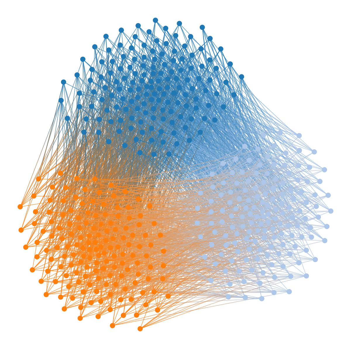
In fact, this kind of visualization will only reveal modular structure of the “assortative” kind, i.e. when nodes of the same module connect preferentially between themselves:
Code
from graph_tool.all import *
import numpy as np

b = np.concatenate((np.zeros(200), np.ones(200)))
d = np.full(400, 4)
g = generate_sbm(b, np.array([[700, 60 ],
                              [60,  700]]),
                 out_degs=d, micro_ers=True, micro_degs=True)
b = g.new_vp("int", vals=b)
remove_parallel_edges(g)
remove_self_loops(g)

graph_draw(g, vertex_fill_color=b, fmt="svg", bg_color=[1,1,1,1])
But this is only one of a multitude of possible mixing patterns in networks. And furthermore, even if you see apparent modular structure in such visualizations, it does not mean they are statistically meaningful.
“Visualization-first” vs. “visualization-second”
Since perfect visual network representations are impossible, we need to delineate what are the trade-offs we’re willing to accept in the context of our research questions, and work within them. Importantly, we need to understand the biases of the chosen projection, and what distortions they introduce.
Alas, this critical analytical stance is rarely incorporated in visual network analyses, and the output of visualizations are often taken for granted. In more extreme cases, the two-dimensional projection of a network is taken as the starting point of an analysis, and is used to judge wether further evaluations are meaningful—e.g. a node centrality measure is good if it coincides with what can be seen in the visualization, a community detection method is working well if the partition is sufficiently separated visually, and so on.
This practice is common in the branch of the humanities known as Science and Technology Studies, in particular with popular software like Gephi, which arguably encourages this kind of “visualization-first” approach.5 When coupled with our tendency to extract specious interpretations from meaningless shapes, this just becomes a bad way of doing science.
5 Gephi’s popularity is not unwarranted. It’s a tool that empowers a vast number of users, who would be almost completely disenfranchised without the visual interface it provides.
Nevertheless, although its authors are aware of many of the issues mentioned here, they are a bit too quick to absolve themselves of their statistical carelessness.
Mathieu Jacomy, the co-creator of Gephi, makes an analogy between statistical neglect (as I see it) and off-label drug use. I find the analogy good: that practice may cause harm and lead to hospitalization!
The degree of formalization of a methodology determines how much we understand it, and a final analysis is scientific to the same extent as our understanding of the methodologies used. There are no shortcuts!
But most importantly: It’s doubtful that Gephi’s users even understand the overwhelming handicap that comes with conducting network analysis entirely through the dull prism of a force-directed layout. Unfortunately, within the confines of software like Gephi, Cytoscape, etc, users currently have no alternative.
“Visualization-first” represents an inversion of priorities in scientific studies. Instead of being the starting point, network visualization should be the result of a well defined analytical procedure, that is informed and determined by our research questions and analytical methodology, and articulates notions of statistical evidence and validity. Otherwise we cannot be sure that the patterns we are seeing should be taken seriously.
Let’s explore these ideas with a couple of examples. Consider below the visualization of citations between blogs discussing the 2004 US presidential election.
Code
from graph_tool.all import *
import matplotlib

g = collection.ns["polblogs"]
g = extract_largest_component(g, directed=False)
pos = sfdp_layout(g)

def rotate(pos, a):
    """Rotate the positions by `a` degrees."""
    theta = numpy.radians(a)
    c, s = np.cos(theta), np.sin(theta)
    R = np.array(((c, -s), (s, c)))
    x, y = pos.get_2d_array()
    cm = np.array([x.mean(), y.mean()])
    return pos.t(lambda x: R @ (x.a - cm) + cm)

pos = rotate(pos, 160)

dprms = dict(fmt="png", output_size=(1200, 1200), bg_color=[1,1,1,1])

graph_draw(g, pos, vertex_fill_color=g.vp.value, vcmap=matplotlib.cm.coolwarm,
           vcnorm=matplotlib.colors.Normalize(vmin=0, vmax=1), **dprms)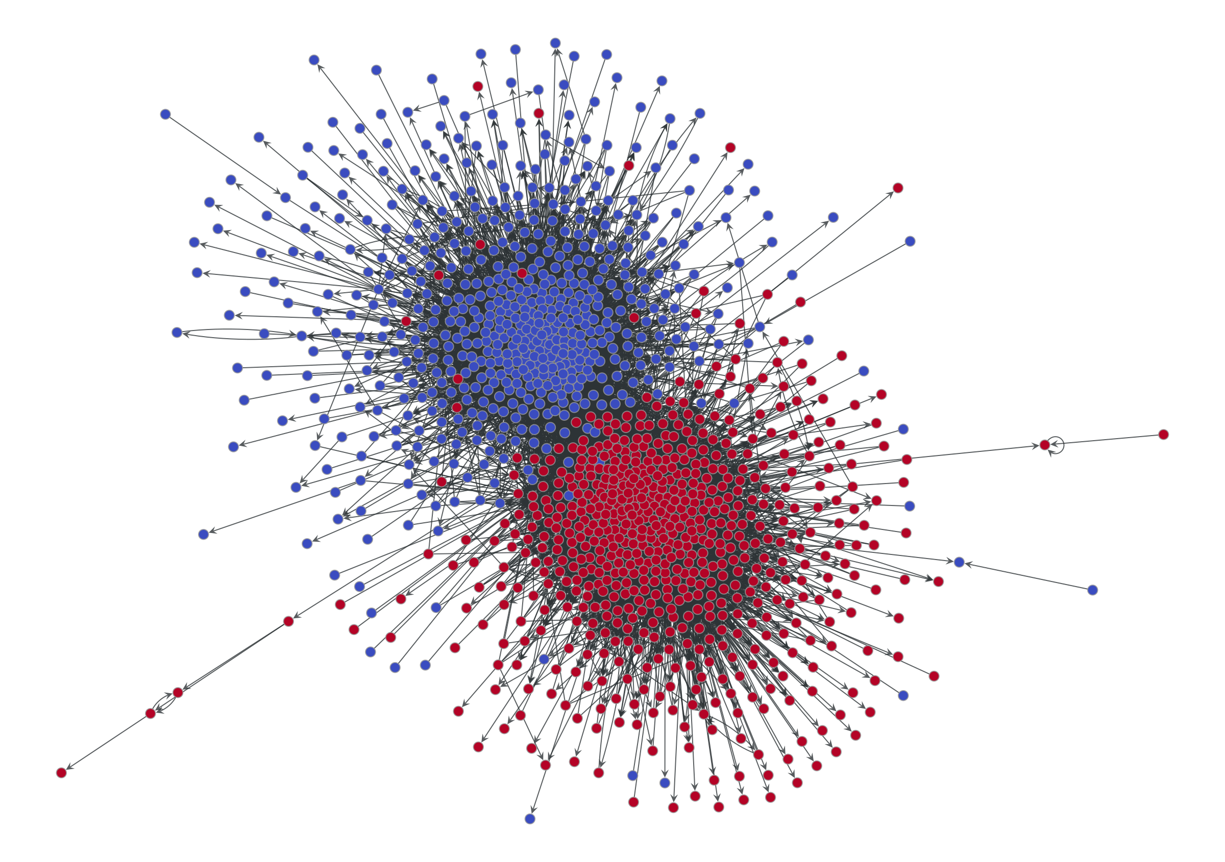
We can see two obvious assortative modules, corresponding to the preferred political affiliation of each blog to one of the two candidates (indicated also by the node colors). This is a pretty straightforward and plausible narrative, well encapsulated by the tagline “divided they blog” of the original paper that analyzed this data [2].
But is this the whole story? Or is just the most prominent pattern that survives the projection? What about non-assortative modular patterns? We know we would not be able to see them if they were there.
How do we detect modular patterns in networks in a statistically robust way? The state-of-the-art consists in inferential community detection [3]6 based on Bayesian methods [4]. These methods evaluate statistical evidence in a principled way and are guaranteed not to overfit.7
6 See here for a detailed HOWTO on inferential community detection using graph-tool.
7 Some widespread methods of module detection like modularity maximization are ill-suited for this task for two important reasons: 1. They are just as blind to general modular patterns as force-directed layouts, and can only uncover assortative mixing; 2. They massively overfit, and will find seemingly “strong” modules even in maximally random networks.
So what happens when we employ such a method on this network? We can see the results below.
Code
state = minimize_nested_blockmodel_dl(g)
state.levels[0].draw(pos=pos, **dprms)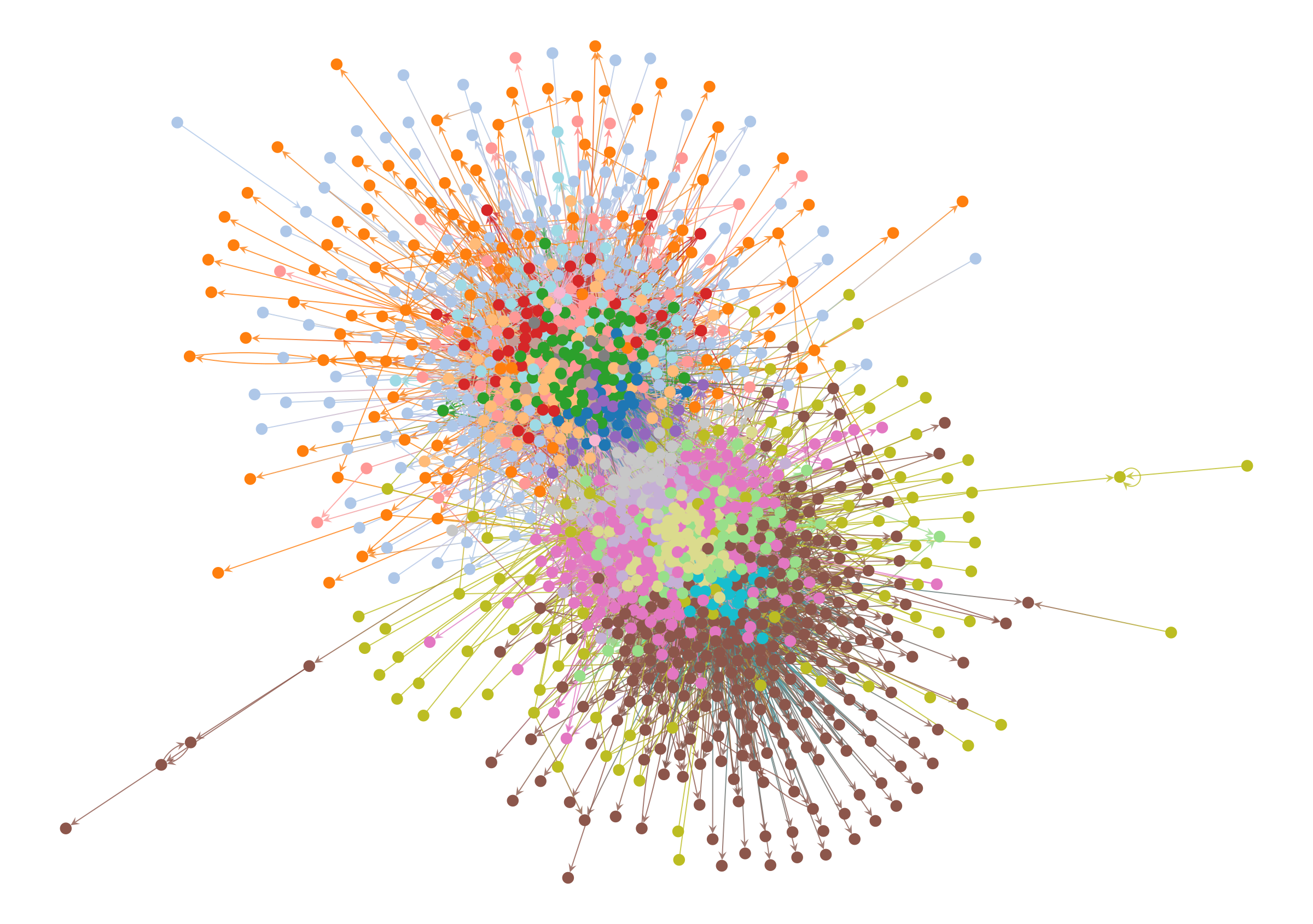
At this point, if you rely on the force-directed layout to judge the quality of the result, you will tend to reject it, since the colors are all mixed together and the structure they represent isn’t at all clear. It’s easy to imagine a Gephi user immediately discarding this result, and opting instead for a more aesthetically pleasing partition of the network—even if it’s a statistical illusion, or obscures important information.
But there’s a better way!
Turning the tables: enforcing visual modularity
There’s no good reason for us to accept the status quo: We can simply modify how the layout behaves based on what we know about the network data, or what we have discovered using a well-defined methodology that is relevant for our research question. Equipped with this information, we can then use it to constrain the visualization, rather than the other way around.
In the case of a force-directed layout we can simply add an additional attractive force between nodes that belong to the same detected module.8 For the political blog network, this results in the following:
8 This can be done in graph-tool by passing the options groups, containing the partition, and gamma, controlling the strength of the attractive force, to the sfdp_layout() function.
Code
pos2 = sfdp_layout(g, groups=state.levels[0].b, gamma=.04)
pos2 = rotate(pos2, 25)
state.levels[0].draw(pos=pos2, edge_gradient=[], edge_color="#33333322", **dprms)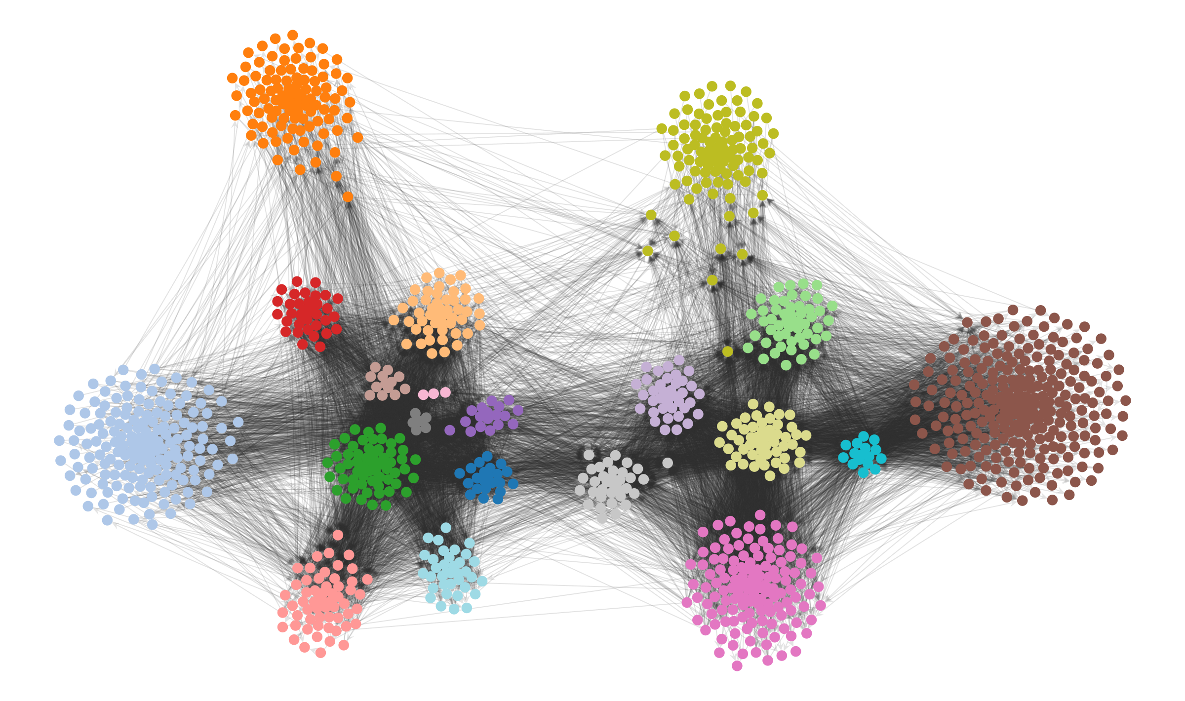
The result is not only more aesthetic, but it enables us to more clearly investigate visually the structure that the our inference algorithm has uncovered. We can see now that the peripheric blogs—those that mostly cite to other blogs but are never themselves cited, or vice-versa—tend to have very specific preferences, and do not cite (or are cited) indiscriminately. Most of the subgroups inside each of the two large factions cite themselves in specific ways, and most citations between them are done by a much smaller subset of the nodes, indicating different degrees of insularity.
None of these statistically valid patterns are visible in the original force-directed layout.
An alternative way of visualizing hierarchical modular structures in networks is via a chordal diagram, as shown below, which can be more readable in some circumstances.
Code
state.draw(bg_color=[1,1,1,1]);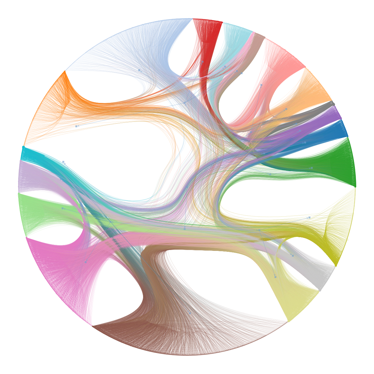
You might be wondering how the bipartite and multipartite graphs we considered earlier will fare under this kind of visualization. The results are exactly as you would expect:
Code
ustate = BlockState(u, b=u.vp.b)
upos = sfdp_layout(u, groups=ustate.b, gamma=.1)
ustate.draw(pos=upos, bg_color=[1,1,1,1])

wstate = BlockState(w, b=w.vp.b)
wpos = sfdp_layout(w, groups=wstate.b, gamma=.1)
wstate.draw(pos=wpos, bg_color=[1,1,1,1])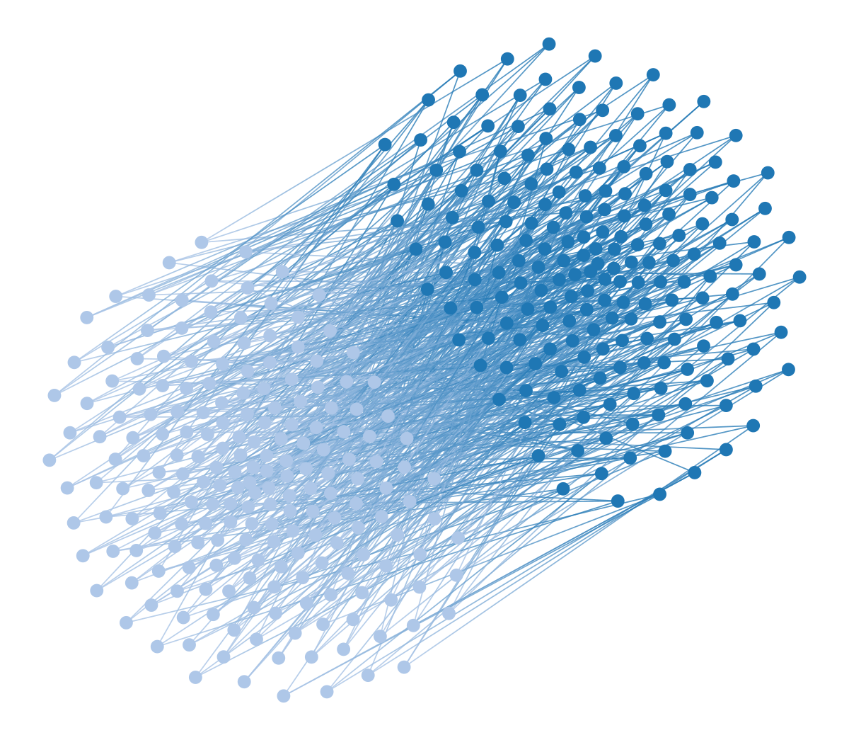
We can also enforce a hierarchical modular structure by adding one additional force per hierarchical level, leading to nested separations at multiple scales:
Code
from matplotlib import pyplot as plt
from matplotlib import patches, path
from scipy.spatial import ConvexHull
import seaborn as sns
from itertools import groupby

pos3 = sfdp_layout(g, pos=pos2, groups=state.get_bs(), gamma=[.04, .1, 0.1])
pos3 = rotate(pos3, -70)

# Now we only need to draw some convex polygons around the groups

class RoundedPolygon(patches.PathPatch):
    # https://stackoverflow.com/a/66279687/2912349
    def __init__(self, xy, pad, **kwargs):
        p = path.Path(*self.__round(xy=xy, pad=pad))
        super().__init__(path=p, **kwargs)

    def __round(self, xy, pad):
        n = len(xy)
        for i in range(0, n):
            x0, x1, x2 = np.atleast_1d(xy[i - 1], xy[i], xy[(i + 1) % n])
            d01, d12 = x1 - x0, x2 - x1
            l01, l12 = np.linalg.norm(d01), np.linalg.norm(d12)
            u01, u12 = d01 / l01, d12 / l12
            x00 = x0 + min(pad, 0.5 * l01) * u01
            x01 = x1 - min(pad, 0.5 * l01) * u01
            x10 = x1 + min(pad, 0.5 * l12) * u12
            x11 = x2 - min(pad, 0.5 * l12) * u12
            if i == 0:
                verts = [x00, x01, x1, x10]
            else:
                verts += [x01, x1, x10]
        codes = [path.Path.MOVETO] + n*[path.Path.LINETO, path.Path.CURVE3, path.Path.CURVE3]
        verts[0] = verts[-1]
        return np.atleast_1d(verts, codes)

fig, ax = plt.subplots(nrows=1, ncols=1, figsize=(4 * 5, 4 * 5 * .6))

clrs = list(reversed(sns.color_palette("muted")))
for l in reversed(range(3)):
    lstate = state.project_level(l)
    vlist = sorted(lstate.g.vertices(), key=lambda v: lstate.b[v])
    hulls = []
    for r, vs in groupby(vlist, key=lambda v: lstate.b[v]):
        vs = list(vs)
        hull = ConvexHull([pos3[v].a for v in vs])
        xy = [pos3[vs[i]] for i in hull.vertices]
        p = ax.add_patch(RoundedPolygon(xy, 0,
                                        facecolor=clrs[l],
                                        edgecolor="black",
                                        linewidth=.5, alpha=.5))
        p.set_zorder(-10)

ax.add_artist(ax.patch)

a = state.levels[0].draw(pos=pos3, edge_gradient=[], edge_color="#33333311", mplfig=ax)
a.fit_view(yflip=True)

ax.get_xaxis().set_visible(False)
ax.get_yaxis().set_visible(False)
ax.spines['right'].set_visible(False)
ax.spines['top'].set_visible(False)
ax.spines['left'].set_visible(False)
ax.spines['bottom'].set_visible(False)
ax.patch.set_facecolor("white")
fig.tight_layout(pad=0.0)
fig.savefig("polblogs-nested.png", transparent=True, bbox_inches="tight", pad_inches=0.0)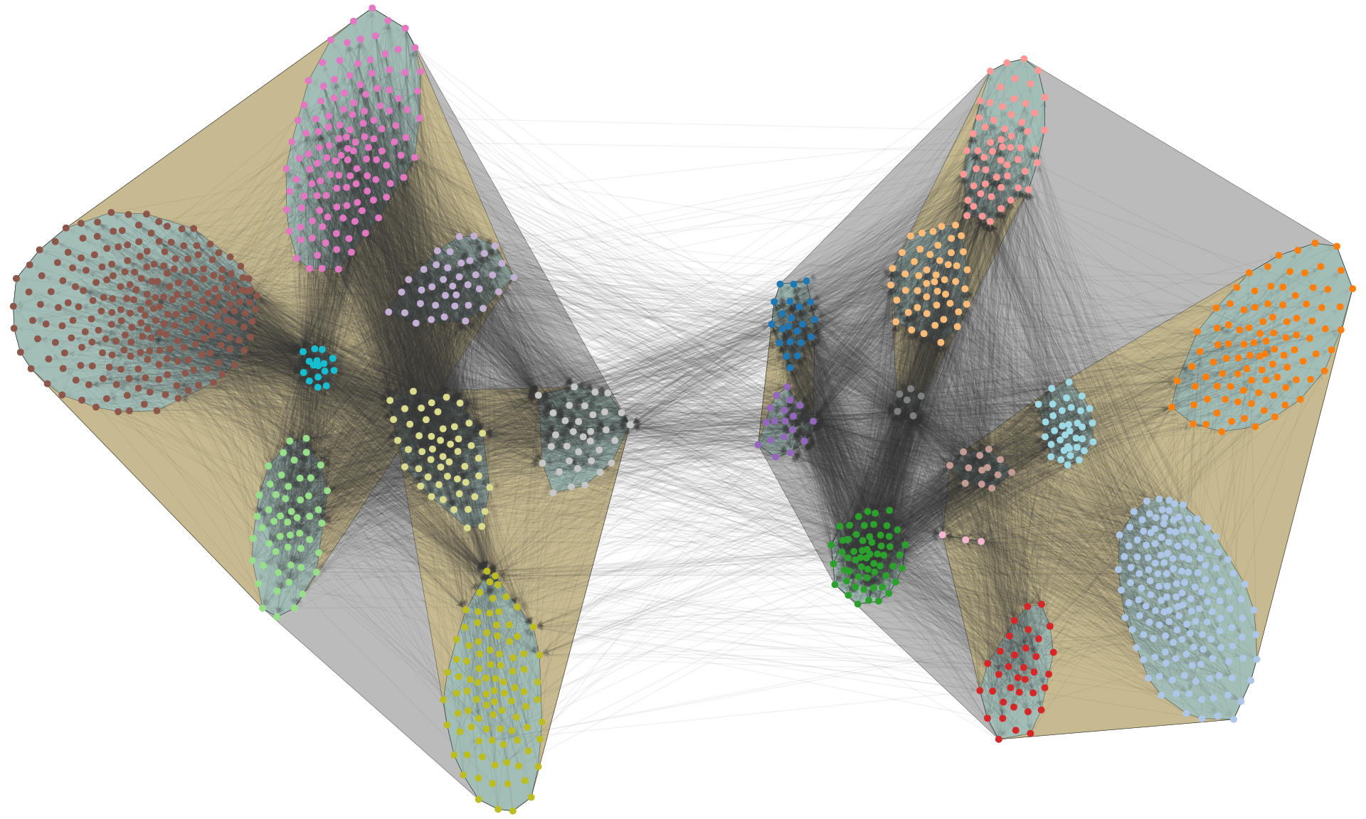
This simple idea opens many opportunities to visualize networks outside of the shackles of standard force-directed algorithms.
Ranked networks
Modularity is not the only aspect that we can enforce in the visualization. Some networks also possess a latent rank—or an ordering—of the nodes. Most force-directed layout algorithms completely ignore the directionality of the edges, and therefore do not capture this kind of structure. So solve this, we can add an additional force that tends to anchor the nodes in the vertical direction according to their relative ordering, together with their modular structure.
For example, the visualization below shows a food web network, with inferred groups and latent ordering [5]:
Code
g = collection.ns["foodweb_little_rock"]
state = minimize_nested_blockmodel_dl(g, state_args=dict(base_type=RankedBlockState))
for i in range(20):
    state.multiflip_mcmc_sweep(beta=numpy.inf, niter=100)
pos = sfdp_layout(g, groups=state.levels[0].b, gamma=.6, rmap=state.levels[0].get_vertex_order(), R=20)
pos = pos.t(lambda x: (x[0], x[1] * 2.4))
state.levels[0].draw(pos=pos, vertex_text=state.levels[0].get_vertex_order(),
                     edge_color=state.levels[0].get_edge_colors().t(lambda x: list(x[:-1]) + [.2] if x[0] < .5 else x),
                     fmt="svg", bg_color=[1,1,1,1])
A standard force-directed layout would make this kind of visualization nearly impossible.
Caveats
The “visualization-second” approach gives the user more control and makes visualizations easier to interpret reliably. But it’s not without its own caveats and limitations. Nothing we can do will solve the fundamental representation problem we described earlier, so the visualizations we obtain in this way are also not without its own distortions and omissions. The main advantage is that these have been articulated explicitly as formal modeling assumptions in the inferential methods that we have used to obtain the modules and orderings that constrain the visualization. We need only to keep in mind that different models exist, which, when used, might reveal other relevant aspects of the data. Therefore, just as no model is final, neither is a particular visualization strategy.
Looking forward, we need to be able to move away from the staple of force-directed layouts, and incorporate not only more methodological rigor but also more creativity in the way we visualize networks. There’s a whole universe of structural patterns out there that we would not be able to see if we stick to the same tired old routine.
References
Webmentions9
(Nothing yet)
9 Webmention is a standardized decentralized mechanism for conversations and interactions across the web.
Comments
If you reply to this post, it will show as a comment below the original article.